Setting out to re-design and updated the Wasteland Ski brochure to reflect the brands new identity was no easy task. Sifting through hundreds of images to find the best set to represent bot the brand and content, factoring
in multiple variables such as delivery weight and portability for staff that would be travelling to pitch meetings all over the country using a variety of transport methods as well as delivering stellar quality on time and on budget.
Scope
- Editorial design
- Photography curation
- Artworking
- Print & production
Outcome
Updating the brand
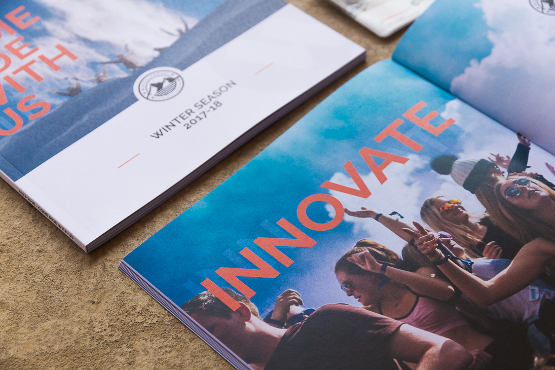
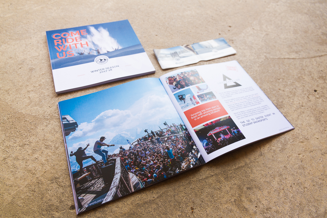
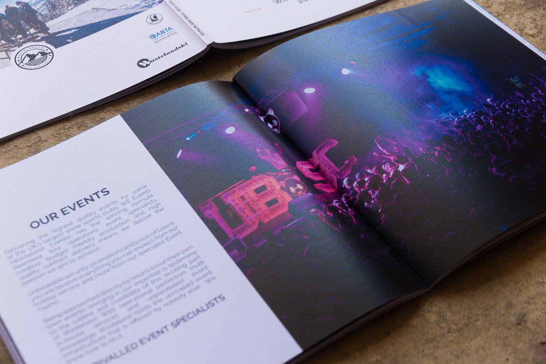
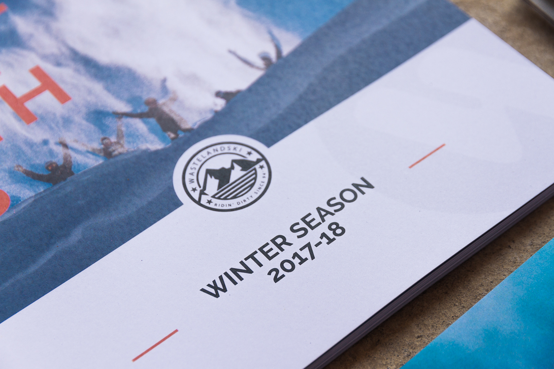
With Wasteland Ski recently refreshing their brand, it was imperative that this was reflected in this new season brochure. The inclusion of new brand colours such as orange and the proposal to pivot away from their traditional black centred design to a much brighter, white paper colour was key in making the new brand stand out against their past iterations.
Photography forward
Using only imagery shot of Wasteland Ski holidays, trips and events, often using the same photographers editing in the same style resulted in an extremely consistent final product, again, it really helps enforce that this was a fresh start for the brands visual communication.
“Fantastic process working with Will, the brochure is one of my favourites from the past few years, it really showcases the new direction we're taking the brand.”
Ben JohnsonMarketing Manager, Wasteland Ski